How to Choose Paint Colours
The look and feel of a room can be changed dramatically with a coat of paint. The right shade and finish can make a room feel bigger, lighter, and even add energy. Picking the colour that is going to optimize the potential of a room can be tricky.
![]() The Colour Wheel
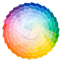
The Colour Wheel
If you look at a colour wheel you will notice that the “warmer colours” of red, yellow, and orange are on one side and the “cooler colours” blue, green and lavender are on the other. When looking to the wheel for inspiration it is important to note that choosing colours from the same half of the wheel will create a sense of harmony, while picking colours on opposite sides of the wheel will create a vibrant look.
Selecting the Perfect Room Colour![]()
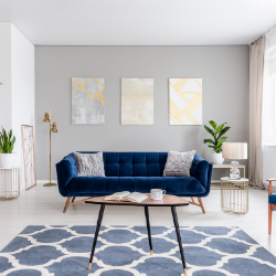
Pick from a dominant colour in the room or the main focal point/item that is going to be your main design concept.
Main Décor Concept Pieces
- Carpet
- Area Rug
- Flooring
- Backsplash
- Fireplace
- Piece of art
- Favourite piece of furniture
How do You Want the Room to Feel
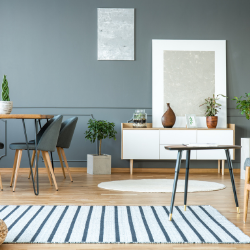
Do you want the room to have a warm feeling? Feel bigger? Smaller? Inviting? Brighter? Neutral? The answers to these questions will help narrow down your paint colour. Darker colours tend to make a room feel smaller, while lighter colours can make a smaller room feel larger. A darker ceiling can have the effect of making a room feel cozy. Want a room to feel like it is spacious? Consider a lighter ceiling. When a room is all one colour space seems to continue whereas if there are colour changes, that creates boundaries, and you take note of the size of the room. Cozy and energetic spaces tend to lean towards the “warmer” colours and fresh and soothing towards the “cool” colours.
Don’t Forget the Part That Light Plays
Lighting in a room can change many times in a day. Morning, afternoon, and artificial light all play a part in how your paint will look throughout the day. What appears to be soft pink in morning light can be a sandy brown in artificial light. Some colours reflect light, while others swallow it. Making sure you know how the light will affect your colour choice is important.
![]() Pro-Tip
Pro-Tip
Once you have narrowed down your paint selection, purchase colour samples and paint a board with each colour. Move the board around your room throughout the day and see how the light changes the colour.
![]() Undertones
Undertones
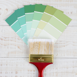
All colours have undertones to consider. But what is undertone? Undertones are the result of blending more than one colour together. The mixing of blue with a black tint to create indigo or red with a white tint to create pink. The dominant colour is the colour you see, the colour you don’t see is the undertone. It is this “secret” colour that can make or break your colour choice in a room. The undertone of your wall colour will pick up the undertones in the features of your room and can create a décor nightmare. Using a colour fan deck will provide a wide spectrum of tones, hues and colours to help you decide on a colour that best suits your room's design. Placing your colour selections next to key items in your room will help determine how the undertones change the look of your colour.
Benjamin Moore Colour Trends 2020 and 2021
2020
In 2020 Benjamin Moore’s Colour of the year was called First Light. It was proclaimed to be a “backdrop for a bright new decade”.
2021
The Benjamin Moore Colour of the year for 2021 is Aegean Teal. It is being hallmarked as “intriguing, balanced and deeply soothing”.
Now that you have it all figured out, and know what is trending, it’s time to get painting!


 The Colour Wheel
 Pro-Tip
 Undertones
.png)
.png)


Post a comment